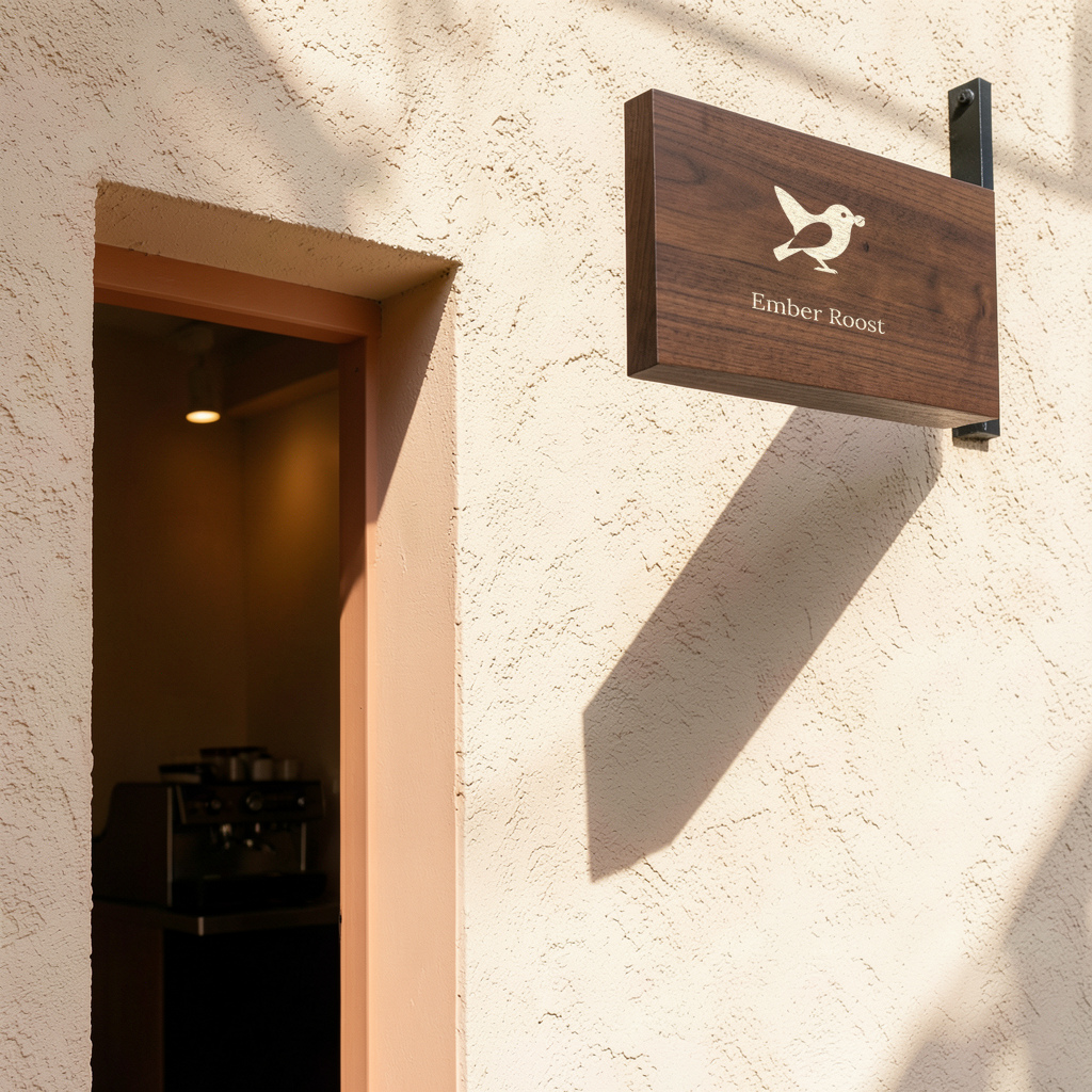
Ember Roost
Coffee roaster. A self-initiated study, not a client commission.

Ember Roost

I'm Landon. I design websites, logos and print-ready files, and I hand them over as plain files you own, each one checked against a written list before you see it. Below: four brands I made up to show the work, then how a project runs.
Download the brief: 7 questions (.txt, under 1 KB)It saves to your device and sends nothing. Fill in what you know; I'll ask about the rest.
Some browsers, especially the ones inside apps, block saved files. Here are the same seven questions to copy into a message or an email:
Send your answers back the way you reached me.
First, the mark
I made for myself.
One letter, built from its parts.
The last part steps forward.
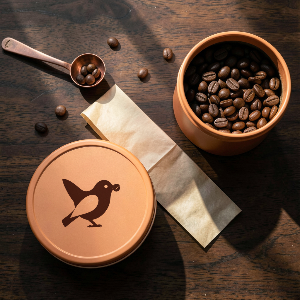
For each of these four businesses I set a direction, made a mark, chose three colours and paired two open-licence typefaces. I use AI tools in the work: each mark and each photograph started as an image from a model running on my own computer (FLUX.2 klein 4B). I traced the mark into a vector, then set the real mark and type into each photograph. The prompt, seed and file hashes for every image are in each study's notes.
No study in that sector yet. I only show work I've finished, and so far that's coffee, bicycle service, dental and books.
Coffee roaster. A self-initiated study, not a client commission.
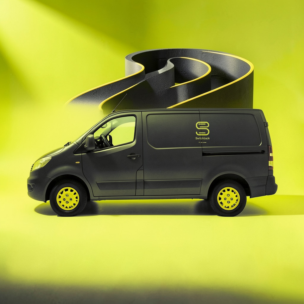
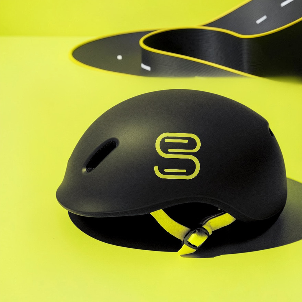
Bicycle service. A self-initiated study, not a client commission.
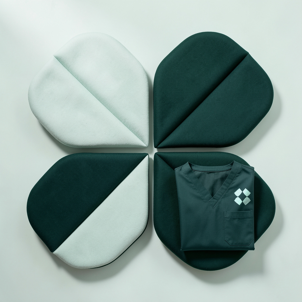
Dental practice. A self-initiated study, not a client commission.

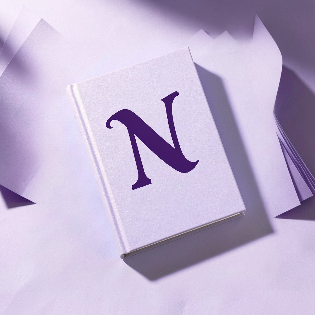
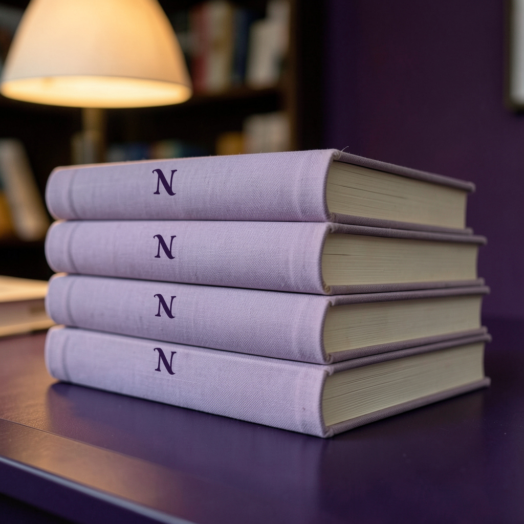
Independent bookshop. A self-initiated study, not a client commission.



What I lost at 16 pixels: the cherry and the eye. The tab shows the bird's outline alone, and I kept it that way rather than put it on a background tile.
Tab contrast, measured: 12.05:1 on a light tab, 3.61:1 on a dark tab. Both clear 3:1, the WCAG minimum for icons. No background tile.
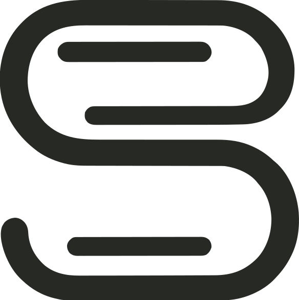


What I didn't plan: I asked for one road line and no letters. It came back with lane lines inside, and it also reads as an S. I kept it, and I'd rather say so than claim I meant it.
Tab contrast, measured: 13.08:1 on a light tab, 3.76:1 on a dark tab. Both clear 3:1, the WCAG minimum for icons. No background tile.


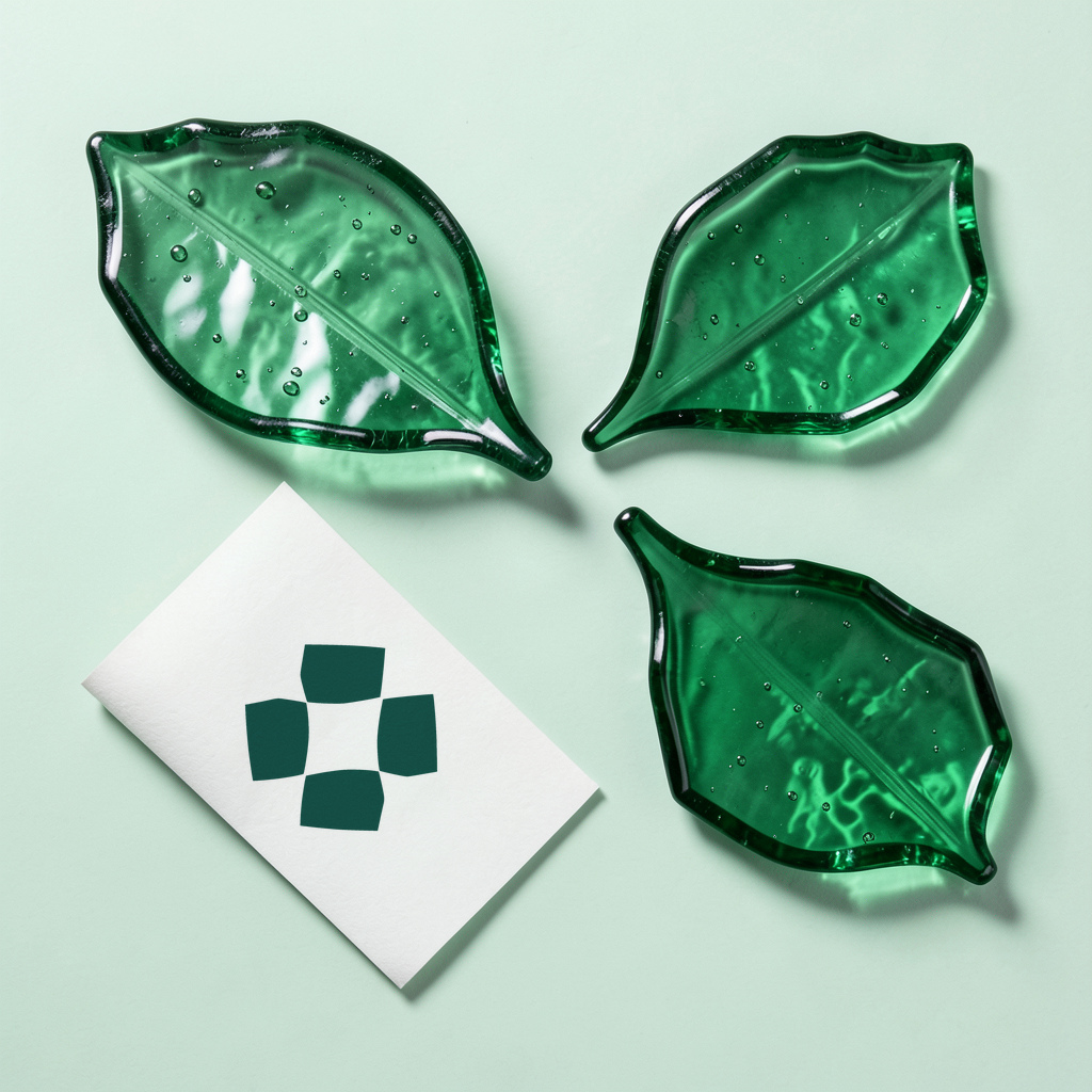
What came out differently: the photograph has three organic glass leaves beside the diagonal card. They suggest the four-leaf mark without matching its geometry exactly.
Tab contrast, measured: 8.77:1 on a light tab, 4.04:1 on a dark tab. Both clear 3:1, the WCAG minimum for icons. No background tile.


What didn't come through: the N was meant to hide a turning page. It doesn't, not clearly, so I show it as an N and claim nothing more.
Tab contrast, measured: 13.35:1 on a light tab, 3.81:1 on a dark tab. Both clear 3:1, the WCAG minimum for icons. No background tile.
Pages built for a phone screen first, handed over as plain files you own. You or your host puts them live.
A mark drawn as a vector, so it works from a sign down to a browser tab, with a palette and a type pairing if you need them. The four studies below are logo work.
Your text and images, laid out to the page size you name and exported as a PDF, checked page by page against your job card. I work from what you send; I don't write the book.
A studio that designs marks should show its own first. This one is a proposal; I haven't settled on it.
Drawn from Fraunces, an open-licence typeface, with the lower half of the B pushed forward.
At 16 pixels an outline B turns to mush, so the tab version is redrawn pixel by pixel: a broad stem, two open counters, the lower bowl two pixels forward.


Every job runs the same five steps, whether it's a website, a logo or a print file. At each one, here is what you send me, what I do and what you get back. I haven't timed a client job yet, so I don't quote durations; the date on your card comes from one rule, in step 3.
You send: the brief from this page: seven questions on what you need, what you already have, where it'll be used, your date, your budget and who has the final say. Blanks are fine.
I do: I read it and send back every question I still have, together, in one numbered message. I don't fill a gap with a guess.
You get: that one message. It's also where I ask the things the brief leaves out: whether you hold the rights to what you're sending, and whether AI tools can be used on your job.
How long: If an answer is still missing five days after my questions, I send one short reminder and then wait. Nothing starts, and no date is set, until the last answer is in.
You send: nothing new. Just a yes.
I do: I write your answers back as a short numbered list: page size and bleed, the files you'll send, who approves, every deliverable, the price, the delivery date and how changes work. The date is a date with a time zone, never "next week".
You get: the job card. Work starts when you reply yes, and not before. Everything after this is checked against it.
How long: The card goes out once the last answer is in.
You send: your files: text, photos, logos, and the fonts if you used special ones. If your source file hasn't arrived, I don't start, and your date moves with it.
I do: websites are built for a phone screen first. A logo starts as up to three directions, and you pick one to develop into the final mark, drawn as a vector so it holds from a shop sign down to a 16-pixel browser tab. Print files are laid out to the page size on your card, from the content you send.
You get: for a logo, the directions, before I develop one. For a website or a print file, nothing until it passes the checks in step 4.
How long: The date on your card comes from a rule: my planning target (48 hours for a fix, four days for a build), counted from the later of your payment and your last answer, plus one working day. If I'm going to miss it, you hear from me by noon the day before at the latest, with a new date.
You send: nothing.
I do: I run every check on the exact files you'll receive. Websites: no sideways scrolling on a 390-pixel phone screen, no tap target smaller than 24 pixels, one main heading per page. Print: every page within 0.7 pt of the size on your card, every font embedded, every placed image at 300 ppi or more, the smallest margin measured, and bleed set where the card asks for it. If you designed the book and I'm only formatting it, the test is that I didn't make it worse, so I render three pages before and after for you to compare.
You get: the check report: every page size, every font and whether it's embedded, the smallest margin, image resolution, and how each check came out.
How long: The checks run again after every round of changes, and the files I send are the files I checked.
You send: your changes, if you have any (see below).
I do: I name each file by size and use, for example Workbook - 6x9 - print interior.pdf. I add a one-page handover note covering how each file was made and with which tools, what's yours, and what you can change. I also add a short note on uploading or printing, for the platform you named.
You get: the files, the handover note and the upload note. Anything you supplied stays yours. I assign you my rights in the files I made. For a website, you or your host puts the pages live; I don't host.
How long: you have seven days after delivery to send your round of changes.
Every request gets the same test against your job card. It's one of three things.
A round is one message from your approver that lists every change. I make the whole list, run every check again, and send it back with the date it'll arrive, written as a date. A second message with new changes is a second round. Each round stays open for seven days after I deliver.
| Job | Rounds |
|---|---|
| One-page website | 1 |
| Multi-page website, or a rebuild | 2 |
| Logo | 2 |
| Each extra brand item (business card, guide, social image) | 1 each |
| Print file | 1 |
Format: HTML, CSS and image files, plus any script the pages use
What opens it: Any web browser to view; any text editor to change
Size: Depends on the site. This site's whole folder, with its fonts and full-size originals, is about 28.7 MB
Format: SVG and PDF, which scale to any size; PNG on transparent and on white, each in full colour and in one colour
What opens it: SVG and PNG: any browser. SVG: Inkscape (free), Illustrator or Figma. PDF: any PDF reader
Size: The four study marks on this page are 6 to 15 KB each as SVG. PDF size not measured yet
Format: One SVG that switches for light and dark tabs, plus 16-pixel PNGs tested on both
What opens it: Any browser
Size: Under 1 KB per PNG on this page (612 to 757 bytes)
Format: The font files, each named with its licence
What opens it: Any computer's font installer
Size: 101 KB to 1.2 MB per file for the fonts on this page. Open-licence only, so you can use them commercially
Format: A print-ready PDF at your card's page size, fonts embedded, with bleed and trim boxes set where the card asks for bleed
What opens it: Any PDF reader; the upload page of the platform you named
Size: not measured yet
Format: The original image, plus a record of how it was made: tool, prompt and seed
What opens it: Any image viewer; the record is plain text
Size: The originals behind the studies below are 1024 x 1024 pixels, 185 to 262 KB
Each study below links to the same kinds of file, so you can open them before you ever write to me.
Better you read this now than find out after you've paid.
Tell me what you have, what it needs to become, and when you need it.
Seven questions in one text file. Fill in what you know and send it back the way you reached me.
Download the brief: 7 questions (.txt, under 1 KB)Nothing is sent, and you don't need an account.
landon@bestfootstudiohq.com